Exciting News for Data Enthusiasts and Bioinformatics Professionals!
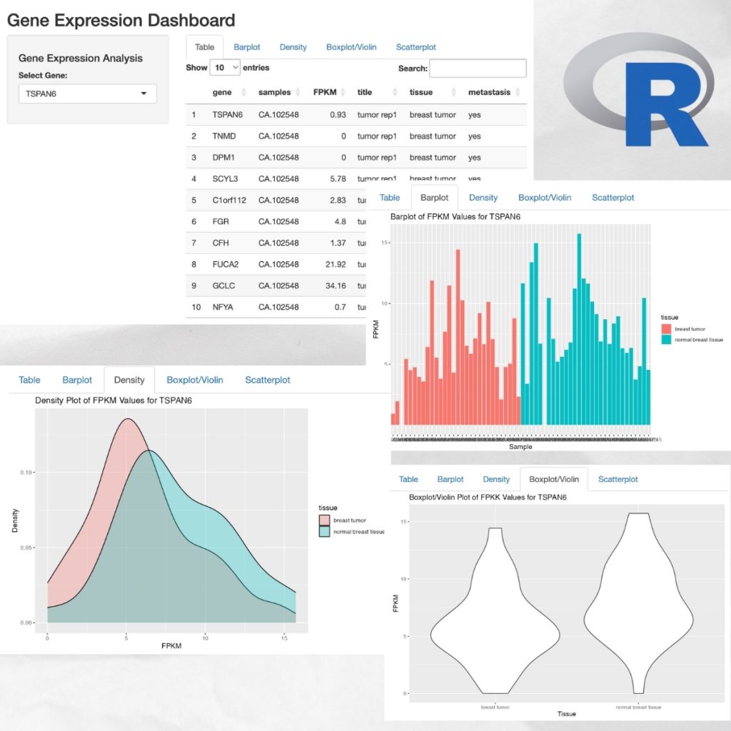
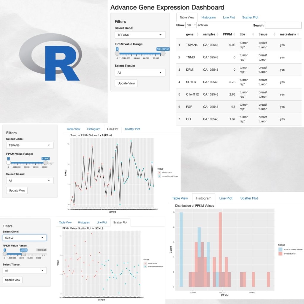
I am thrilled to share my latest project – a dynamic dashboard visualizing Gene Expression Data, created using R Shiny. This tool is designed to help researchers and data scientists gain insights into complex genetic data through an interactive interface.
Why is this important?
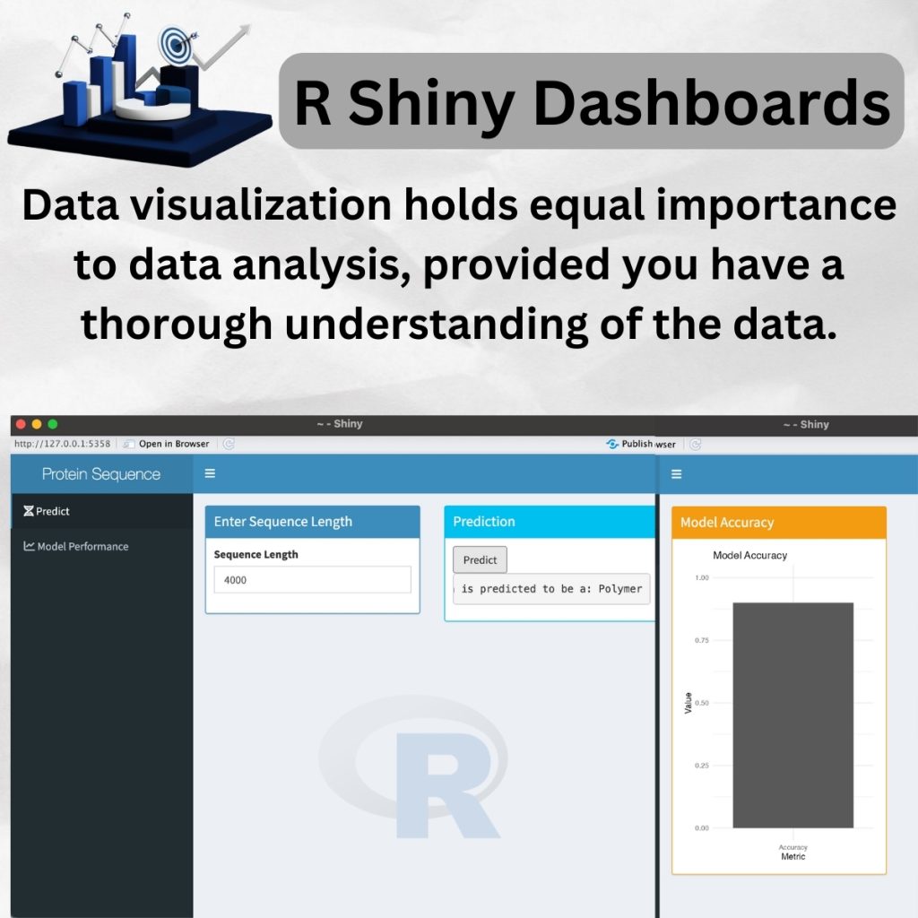
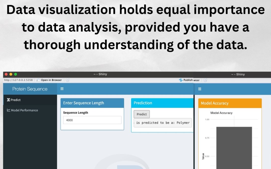
Visualizing data is just as crucial as analyzing it. A well-crafted visualization brings data to life, making complex patterns understandable and actionable. This dashboard not only simplifies the exploration of gene expression levels but also enhances our ability to make data-driven decisions in biotechnology.
Explore the Dashboard:
I have made the entire project open-source. You can access the code and try the dashboard yourself by visiting my GitHub repository. Dive into the data, tweak the code, and see how visual analytics can transform numbers into narratives. I have included YouTube demonstration link as well.
🔗 GitHub Link: https://github.com/smthorat/R-Programming
🔗 YouTube Link: https://youtu.be/iLK4xOKdkYg
I encourage you to play around with it and share your thoughts or feedback. Let’s connect and discuss how we can leverage data visualization to advance our understanding in various fields!