
Data visualization plays a crucial role in analysis by bridging the gap between data and results. Mass spectrometry facilitates an in-depth examination of complex proteomes. Given the widespread availability of mass spectrometry, we are now faced with a vast amount of data requiring analysis and visualization. This article will explore the most common visualization methods, emphasizing their application and how to interpret them.
Visualization of Proteomics Data: General Workflow
Protein Digestion: First, proteins are broken down into smaller pieces called peptides. This is done using special enzymes that cut proteins at specific points. It’s a bit like using scissors to cut a long string into smaller, more manageable pieces.
Peptide Separation and Measurement: These peptides are then sorted and analyzed using a combination of liquid chromatography (LC) and mass spectrometry (MS). Liquid chromatography is a technique that separates the peptides based on their physical and chemical properties. Once separated, the mass spectrometer measures the mass of these peptides and their fragments. This two-step mass measurement process is known as LC-MS/MS.
Identifying Peptides: The information gathered from the mass spectrometer is then used to figure out which peptides (and therefore which proteins) were in the sample. This is done by comparing the measured peptide masses to a reference database of protein sequences, which is like matching pieces of a puzzle to see which ones fit.
Quantifying Proteins: After identifying the peptides, the next step is to figure out how much of each protein is present. There are different ways to do this, but they all aim to either measure how much of a protein is in one sample (absolute quantification) or compare the amounts of a protein across different samples (relative quantification).
Aggregating Information: Finally, the information about the peptides is put together to understand the proteins they came from. This process can be complex because many peptides can come from the same protein, and a single peptide can sometimes be a part of different proteins.
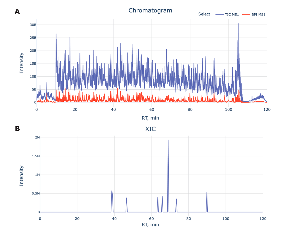
Figure A: Displays a chromatogram with a blue line for Total Ion Chromatogram (TIC) and a red line for Base Peak Intensity (BPI). The X-axis is the time it takes for peptides to travel through the chromatography column (retention time), and the Y-axis is how much of each peptide is detected (intensity). The TIC gives an overall picture of all peptides, while the BPI shows the most abundant peptide at each moment.
Early and Late Data Exclusion: The start and end parts of the chromatogram often don’t have useful data (due to system stabilization and cleaning) and are ignored.
Figure B: Shows Extracted Ion Chromatograms (XICs) which simplify the data by focusing on specific peptides, making it easier to identify and quantify them within the sample.
Peptide Fragmentation: Amino Acids to Mass Spectrometry
To understand peptide fragmentation, one must first grasp the basic structure of amino acids, the building blocks of peptides and proteins. Amino acids have a central carbon atom (called the alpha carbon) to which an amino group (NH2), a carboxyl group (COOH), and a variable side chain (denoted as ‘R’) are attached. The ‘R’ group differs from one amino acid to another, which gives each amino acid its unique properties.
These properties include the electrical charge, which can be positive, negative, or neutral. Some amino acids are polar, meaning they can form dipoles due to an uneven distribution of electrons, while others are nonpolar and do not form dipoles. When amino acids join to form peptides, they do so through peptide bonds that release a molecule of water and link the amino group of one amino acid to the carboxyl group of another.
During mass spectrometry analysis, the peptides are fragmented. This fragmentation can break different bonds within the peptide, leading to various types of fragments. Some fragments are informative, providing insights into the peptide’s sequence, while others may not be useful for analysis. It is crucial to identify and interpret the informative fragments to determine the structure and identity of the original peptides and proteins.
Visualization at the Fragment Level
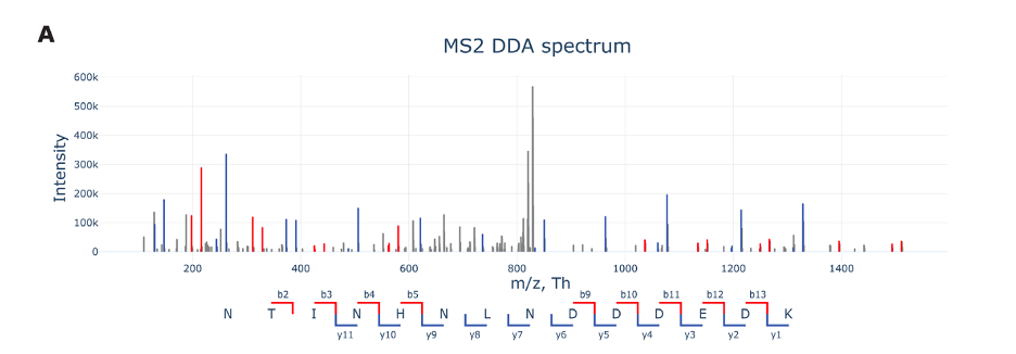
Above figure A shows an MS2 spectrum from data-dependent acquisition (DDA) in proteomics, a technique used to analyze protein fragments. In an MS2 spectrum, we’re looking at fragments generated from a specific peptide, rather than the whole mixture. Here’s how to understand the figure:
m/z (Mass-to-Charge Ratio): The X-axis displays the mass-to-charge ratio (m/z) of ions. In proteomics, peptides are ionized, and their mass-to-charge ratio is measured. It’s like a barcode for each fragment that tells us about its size and charge.
Intensity: The Y-axis represents the intensity of the signals, which correlates with the abundance of ions. A higher peak means more of that particular fragment is present in the sample.
Peptide Fragmentation: The labels along the bottom (like b2, b3, y1, etc.) represent different types of peptide fragments. These fragments result from breaking the peptide at different points. The ‘b’ series starts from the beginning (N-terminus) of the peptide, while the ‘y’ series starts from the end (C-terminus). The numbers indicate how many amino acids are included in the fragment.
Colors: The peaks are often color-coded to help distinguish between different types of fragments. For instance, b-ions may be one color while y-ions are another, making it easier to interpret the spectrum.
Data Acquisition: Data-dependent acquisition means that the mass spectrometer selects which peptide ions to fragment based on their abundance. This is like picking the loudest voices in a crowd to listen to more closely.
By analyzing the MS2 spectrum, scientists can deduce the sequence of amino acids in the peptide. This is essential for understanding the protein’s structure and function. Each peak’s position and height give clues about the peptide’s make-up and the relative amounts of each fragment.
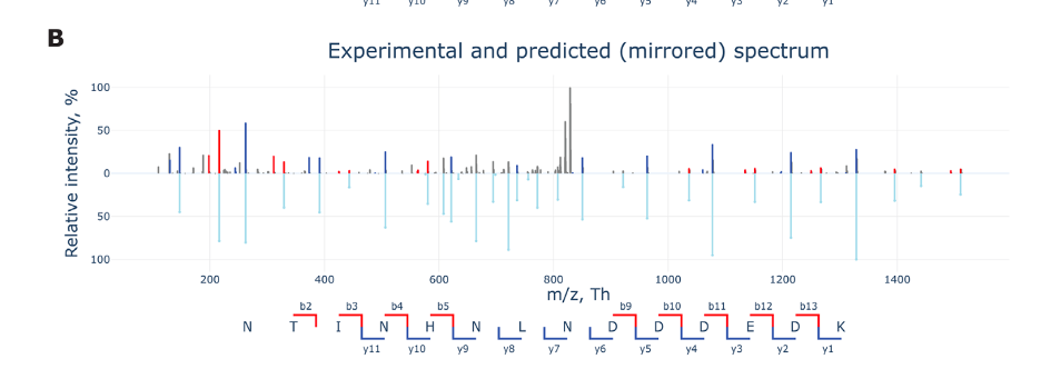
Figure B presents a mirrored plot comparing experimental and predicted fragmentation spectra of a peptide in a proteomics experiment.
Top Part: Shows the actual experimental data. Each peak represents the intensity of a peptide fragment ion, measured by its mass-to-charge ratio (m/z) on the X-axis.
Bottom Part: Depicts the predicted spectrum, which is based on theoretical fragmentation of the peptide. It’s essentially what we expect to see from the peptide based on its sequence.
Intensity: The Y-axis shows the relative intensity in percentage. The higher the peak, the more of that fragment was detected.
Fragment Labels: The letters and numbers (like b2, y11, etc.) label different fragment types, indicating points where the peptide might break apart during the mass spectrometry process. “b” fragments start from the front end of the peptide, and “y” fragments start from the back end.
The mirrored layout helps quickly compare the experimental results with theoretical predictions to confirm peptide identities or study fragmentation patterns.
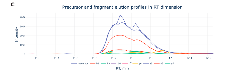
Figure C, labeled, displays the elution profiles of a peptide precursor and its associated fragment ions during a liquid chromatography-mass spectrometry (LC-MS) run.
Retention Time (RT): The X-axis shows the retention time in minutes, which indicates when each molecule elutes (or comes out) from the liquid chromatography column.
Intensity: The Y-axis measures the intensity of ions detected. It represents how much of each ion is present at a particular time.
Elution Peaks:
- The blue line labeled ‘precursor’ tracks the elution of the intact peptide before it’s broken into fragments.
- The other lines represent different fragment ions, identified by labels like b2, b3, y4, etc., which are pieces of the peptide that result from fragmentation in the mass spectrometer.
- These fragments help in deducing the sequence of the peptide, as each has a unique retention time and intensity profile.
Elution Profile Analysis: By examining these profiles, scientists can learn not only about the peptide’s structure but also about its behavior in the chromatography system, such as how well it separates from other molecules and how it responds to the fragmentation process.
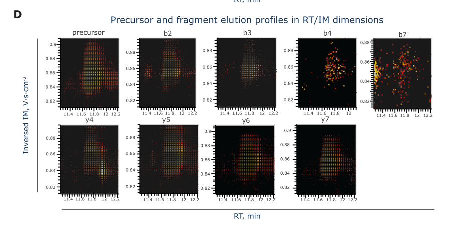
Figure D, labeled, showcases a set of heatmaps illustrating the elution profiles of a peptide precursor and its fragment ions, not just in retention time (RT) but also considering their ion mobility (IM) measurements. Here’s a breakdown:
Axes:
- The X-axis represents retention time (RT) in minutes, which is when the molecules are eluting out of the LC column.
- The Y-axis indicates the ion mobility (IM) dimension, which separates ions based on their shapes and charges as they move through a gas under an electric field.
Heatmaps: Each heatmap corresponds to a different ion type — the ‘precursor’ is the intact peptide, while the ‘b’ and ‘y’ series represent fragments from different cleavage points.
Color Intensity: The colors within the heatmaps range from dark (low intensity) to bright (high intensity), depicting the abundance of ions at specific retention times and ion mobility values.
These heatmaps give a multidimensional view of how the peptide and its fragments behave during the LC-MS process, combining information about their separation in time (RT) and physical properties (IM). This richer dataset helps in more precisely identifying and characterizing the peptides.
Peptide and PTM Visualization
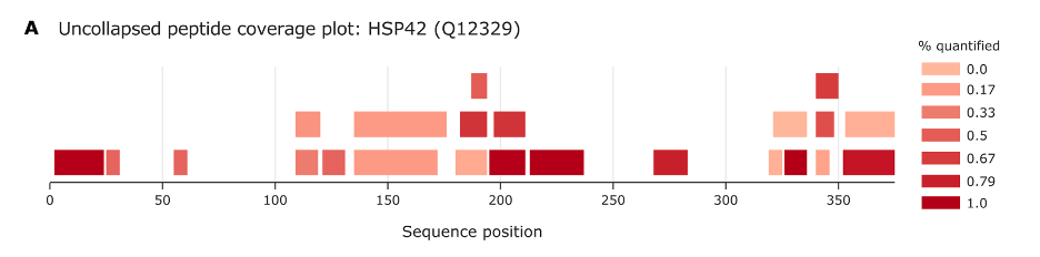
Figure A provides a visual summary of the peptides that have been identified from a particular protein, known as HSP42, across its sequence. Here’s what it tells us:
Sequence Position: The horizontal axis represents the linear sequence of amino acids in the protein from start (left) to end (right). Each position number corresponds to an amino acid in the protein.
Peptide Coverage: The bars along the sequence show where peptides have been detected. A bar at position 50, for example, means that a peptide covering the region around the 50th amino acid in the sequence has been identified.
Color Scale: The color intensity of the bars indicates the frequency of identification or quantification for each peptide, with darker shades representing higher frequency or higher quantification percentages. The scale on the right relates color to the percentage quantified, with 0% being not quantified at all (lightest shade) and 100% (darkest shade) being quantified with high confidence.
Overlap and Coverage: The overlap of bars at certain points indicates that multiple peptides covering the same sequence region have been identified. This can show which parts of the protein are more readily observed or potentially more abundant in the sample.
In essence, this plot helps scientists understand which parts of HSP42 are being detected by their methods, and how reliably these areas are being observed. It’s a crucial part of validating protein identification and understanding the protein’s expression and its potential modifications.
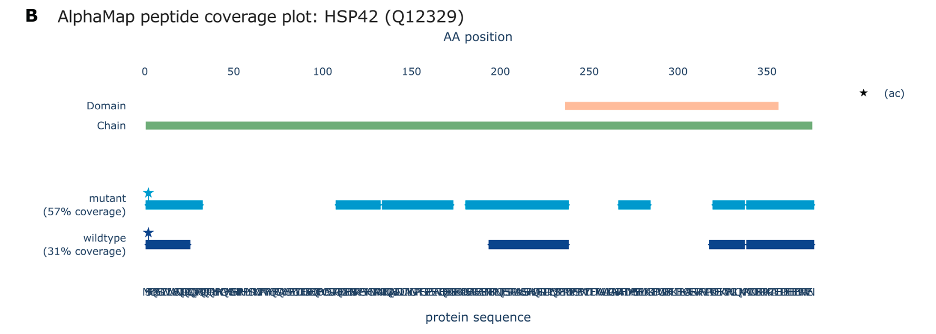
Figure B represents a coverage plot from a proteomic analysis of the HSP42 protein, using the AlphaMap tool to compare peptide coverage between wildtype and mutant forms of the protein.
Protein Domain Representation: The green bar at the top indicates the entire length of the protein chain, with specific domains possibly highlighted by the colored bar (if present).
Peptide Coverage:
The blue bars below represent regions of the protein sequence where peptides were identified. The coverage is shown for both mutant (darker blue) and wildtype (lighter blue) forms of the protein.
The percentage values (57% for mutant, 31% for wildtype) indicate how much of the protein sequence is covered by identified peptides in each form.
AA Position: The horizontal axis marked ‘AA position’ (Amino Acid position) shows the linear sequence of the protein in terms of amino acid residues, starting from the N-terminus (left) to the C-terminus (right).
Post-translational Modifications (PTMs):
The star symbol (ac) indicates the position of an N-terminal acetylation, a common post-translational modification.
This visualization aids in comparing peptide coverage between different versions of the protein, indicating which parts of the protein sequence are detected in each case and showing any modifications that have been identified. It’s particularly useful for understanding the effects of mutations on protein structure and function.
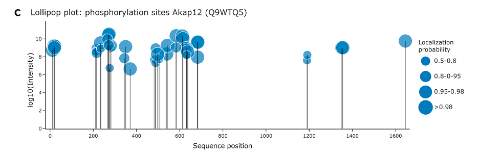
Figure C displays a lollipop plot that visualizes phosphorylation sites on the protein Akap12. Here’s a simple breakdown:
Sequence Position: The horizontal axis shows the positions of amino acids along the protein’s sequence.
Intensity of Phosphorylation: The vertical axis, labeled with log10(Intensity), indicates the relative intensity of the detected phosphorylation signal at each site. The use of a logarithmic scale helps to display a wide range of values in a compact and readable format.
Phosphorylation Sites (Phosphosites): Each “lollipop” (circle on top of a line) represents a site on the protein where phosphorylation was detected.
Localization Probability: The size of each circle corresponds to the localization probability of the phosphorylation event. Larger circles indicate a higher probability that the site is correctly identified as phosphorylated. The legend on the right explains the range of probabilities represented by the circle sizes:
- Smallest circles: 0.5–0.8 probability
- Medium circles: 0.8–0.95 probability
- Larger circles: 0.95–0.98 probability
- Largest circles: >0.98 probability
This type of plot allows researchers to quickly assess which sites are phosphorylated, the confidence in each site’s localization, and the relative intensity of phosphorylation across the protein sequence.
Dataset properties and two-condition comparisons
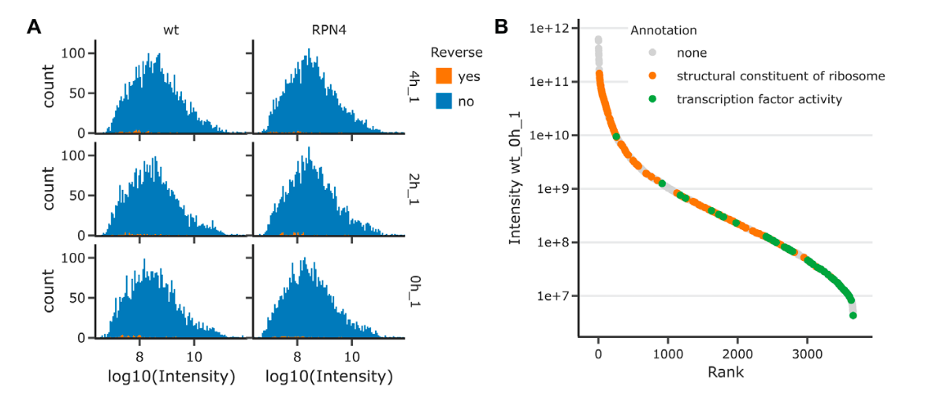
The image presents a comparative proteomic analysis between wildtype (wt) and ΔRPN4 budding yeast cells, with data visualizations focusing on protein intensities and annotations.
Figure A: Intensity Histograms
- These histograms compare the distribution of protein intensities (log10 scale) between the wildtype and RPN4 mutant yeast cells.
- Each row represents a different technical replicate, indicated by ‘T1_up’, ‘T2_up’, and ‘T3_up’.
- The blue bars represent actual protein group counts from the experiment, while the orange ticks at the bottom indicate false positives identified from a reverse decoy database (a quality control measure).
- The histograms help assess the comparability of samples by showing the intensity distribution of detected proteins.
Figure B: Protein Rank Plot
- This plot ranks proteins from highest to lowest abundance based on their intensity, illustrating the dynamic range of protein detection in the experiment.
- The plot uses a logarithmic scale for intensity to accommodate the broad range of protein concentrations.
- Different colors represent annotations or functions of proteins: grey for no annotation, orange for proteins that are structural constituents of ribosomes, and green for proteins with transcription factor activity.
- Such a plot is useful for visualizing the abundance and detection sensitivity of proteins with specific functions within the dataset.
- Together, these visualizations provide insights into the experimental quality, the comparability of different conditions (wildtype vs mutant), and the abundance of various proteins, highlighting the dynamic range of protein expression captured in the study.
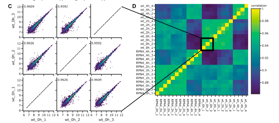
The image contains two sections, C and D, related to the analysis of proteomics data comparing wildtype and ∆RPN4 yeast cells.
Figure C: Pairwise Correlation Plots
- Each scatter plot shows the correlation between two technical replicates, comparing protein intensities (logarithmic scale) from the same condition (wildtype or ∆RPN4).
- The closer the points cluster to the diagonal line, the higher the correlation between the two replicates.
- The numbers inside the plots indicate the Pearson correlation coefficient, with values close to 1 suggesting a high degree of reproducibility between replicates.
Figure D: Sample Correlation Matrix
- This matrix presents the correlation coefficients between all pairs of samples as a heatmap, providing an overview of how similar the protein expression profiles are across all replicates and conditions.
- The color scale on the right corresponds to the correlation values, with green representing lower and yellow representing higher correlation.
- The samples are grouped by condition and time point (wildtype at different hours, ∆RPN4 at different hours), and blocks of higher correlation are visible along the diagonal, indicating strong within-group similarity.
- The zoomed-in square highlights a subset of the matrix, showing particularly strong correlations (high similarity) between certain samples.
- These visualizations demonstrate the reliability of the data (reproducibility) and help to visualize the relationships and similarities between different experimental samples, which is important for validating the experimental design and the quality of the data obtained.
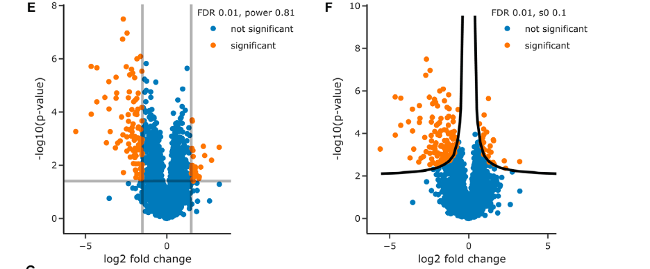
The image contains two sections, E and F, which are volcano plots from a proteomic comparison between wildtype and ΔRPN4 yeast samples.
Figure E: Volcano Plot with Square Significance Cutoffs
- The X-axis displays the log2 fold change in protein abundance between conditions, with negative values indicating downregulation in ΔRPN4 and positive values indicating upregulation.
- The Y-axis shows the -log10 p-value, which represents the statistical significance of the change in protein abundance.
- Points above the horizontal line represent proteins with significant changes in abundance after adjusting for multiple testing (FDR < 0.01), and points outside the vertical lines represent proteins with at least 1.5 fold change in abundance.
- Orange points are statistically significant changes, and blue points are not significant.
- The statistical power of this analysis is 0.81, indicating a high probability of detecting a true effect.
Figure F: Volcano Plot with Nonlinear Cutoffs
- Similar axes as in figure E, but with a nonlinear significance threshold indicated by the curved black lines.
- The s0 value (0.1) is a parameter that adjusts the p-value threshold, accommodating a moderate effect size.
- Points above the curved line are considered significant, with the same color coding as in figure E.
- Volcano plots are used in differential expression analyses to identify proteins that show significant changes in abundance between different conditions. These visualizations are helpful in quickly identifying proteins that are significantly regulated and warrant further investigation.
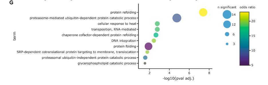
Figure G appears to be an enrichment analysis plot that correlates biological processes with the level of significance and the extent of enrichment found in the proteomic data.
Biological Terms (Y-axis): Each row corresponds to a different biological process or molecular function identified in the enrichment analysis.
Significance (X-axis): The -log10(pval adj.) on the X-axis indicates the significance of the enrichment of each term. The higher the value, the more statistically significant the term is.
Circle Size: Represents the number of significant proteins involved in each biological term. Larger circles indicate a higher number of proteins.
Color Scale: Reflects the odds ratio, a measure of the enrichment factor. Warmer colors (e.g., yellow) suggest a higher odds ratio, indicating a greater level of enrichment for the term within the significant proteins compared to what would be expected by chance.
Statistical Correction: The enrichment analysis has been corrected for multiple hypothesis testing using the Benjamini-Hochberg method to control the false discovery rate (FDR) at 5%, ensuring the results are less likely to be due to random chance.
The plot helps in identifying which biological processes are overrepresented in the set of proteins found to be significantly different between the studied conditions (such as wildtype vs. ΔRPN4 yeast samples), providing insights into the biological implications of the proteomic differences observed.
Visualization of multidimensional experimental designs
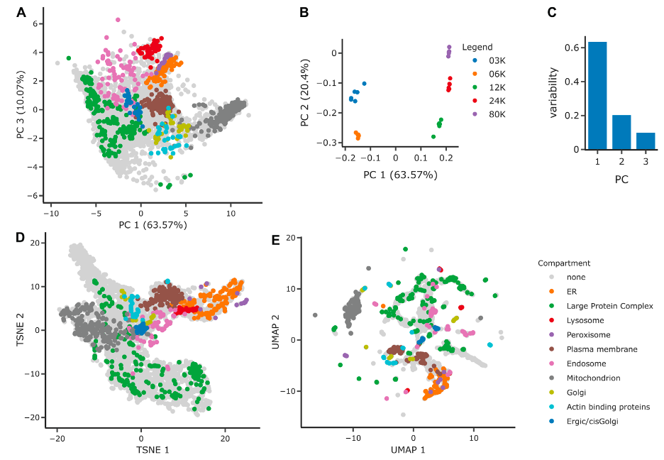
These figures comprises several panels that illustrate the application of different dimensionality reduction techniques to a spatial proteomics dataset, aiming to discern the organization and separation of protein groups into cellular compartments.
Figure A: PCA Projection on PCs 1 and 3
- This scatter plot represents the protein groups projected onto the first and third principal components (PCs), showing the separation of these groups into distinct cellular organelles.
- Each color represents a different cellular compartment, and the positioning of the groups suggests how they are differentiated in the multidimensional proteomics data.
Figure B: PCA Loadings on PCs 1 and 2
- This plot shows how individual samples (different fractionation levels like 3K, 6K, 12K, 24K, 80K) load onto the first two principal components.
- The separation along PC1 suggests a distinction between samples with lower (< = 6K) and higher (> = 12K) fractionations, while PC2 further distinguishes between the fractionations within these groups.
- Instead of showing points, loadings in PCA are often represented with arrows, pointing in the direction of the maximum variance that each principal component represents.
Figure C: Variability Explained by PCs
- A bar chart showing the proportion of data variability explained by each of the first three principal components.
- These first three PCs account for over 90% of the total variability in the dataset, with the first component explaining the majority.
Figure D: tSNE Projection
- A t-distributed Stochastic Neighbor Embedding (tSNE) scatter plot, a non-linear dimensionality reduction technique.
- It shows a similar data density as the PCA but with a different spatial arrangement of the organelles, potentially revealing subtler structures within the data.
Figure E: UMAP Projection
- A Uniform Manifold Approximation and Projection (UMAP) scatter plot, another non-linear technique that emphasizes local data structure.
- This method results in clusters being more visible due to an increased local density, as compared to PCA and tSNE.
These panels collectively demonstrate how complex proteomics data can be visualized to enhance our understanding of cellular compartmentalization. Dimensionality reduction techniques like PCA, tSNE, and UMAP reduce the complexity of the data while preserving key patterns and structures that help interpret the underlying biology.
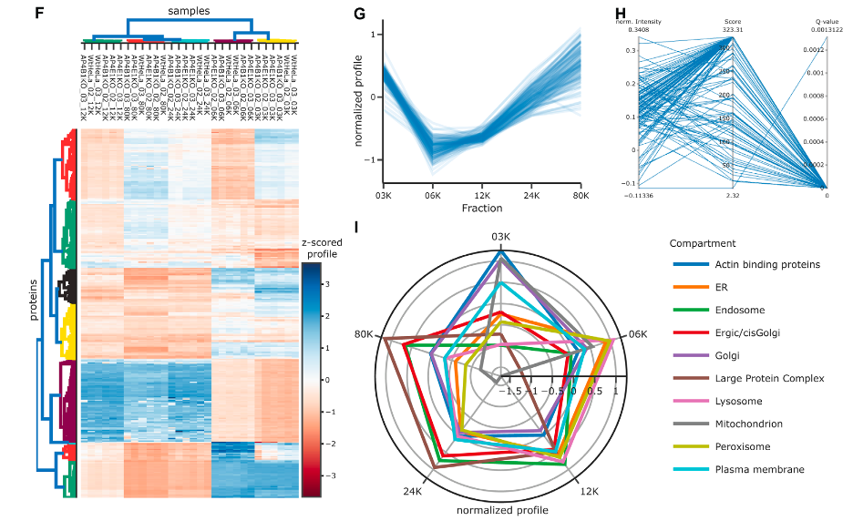
In the figure, there are multiple panels illustrating various ways to analyze and visualize proteomic data, particularly focusing on the distribution of organelle marker proteins across different cellular compartments.
Figure F: Heatmap with Dendrograms
- This heatmap presents z-scored protein expression levels across various samples, with rows representing individual proteins and columns representing samples.
- Marginal dendrograms show clustering of samples and proteins: samples are clustered by Pearson correlation, indicating similarity in protein expression profiles, and proteins are clustered by Euclidean distance, suggesting similarities in their expression across the samples.
- Color gradations indicate the expression level of each protein, with blue for lower and red for higher expression levels.
Figure G: Line Plot for ER Marker Proteins
- A line plot illustrates the normalized expression profiles of endoplasmic reticulum (ER) marker proteins across different fractions (03K, 06K, 12K, 24K, 80K).
- The plot provides a visual representation of how these marker proteins are distributed along the subcellular dimension, with the light blue lines showing individual proteins and the dark blue line indicating the average trend.
Figure H: Parallel Coordinates Plot
- This plot connects multiple dimensions of data, specifically identification score and q-value, with normalized protein intensity for a single sample.
- By allowing multiple scales on different axes, it provides a means to observe relationships between data points that are otherwise measured on different scales.
Figure I: Radar Plot for Organellar Markers
- The radar (or spider) plot visualizes average profiles for each group of organellar marker proteins, such as the ER, Golgi, mitochondrion, etc.
- Each axis represents a fraction or cellular compartment, and the distance from the center indicates the normalized abundance of the markers for that organelle.
Collectively, these panels offer insights into the proteomic landscape of the cell, indicating the abundance and distribution of proteins associated with specific organelles. Each visualization method provides a unique perspective on the data, from clustering patterns to distribution profiles.
Conclusion
This review presents an overview of data visualization techniques tailored to the proteomics domain, spanning from raw data representation to intricate experimental setups. Recognizing the dynamic nature and translational potential of proteomics, this review extends beyond merely referencing existing visualization tools. It also offers practical guidance for creating standard data visualizations programmatically, alongside providing critical insights for their accurate interpretation.
Given the continuous evolution of experimental methodologies in proteomics, this review does not claim to be exhaustive. Rather, it anticipates the transformative impact that emerging interactive web technologies and virtual reality will have on proteomics data exploration. The prospective advancements are particularly relevant for surmounting current challenges in visualizing data in three dimensions.
The review concludes with an encouraging note for readers to experiment with various types of visualizations and to actively engage with data visualization as an innovative and essential component of scientific inquiry and communication.